
Catch the Color | Princess Blue & Silver Birch
Match made in heaven.
“Princess Blue conveys trust, stability, and calm—qualities essential in travel environments where passengers often experience stress. Silver Birch, with its reflective and clean character, amplifies brightness and spatial clarity.”
Dialogue between stability and light
“Across architecture, airport waiting rooms, and hotel lobbies, Princess Blue and Silver Birch create a visual dialogue between stability and light. One color grounds, the other elevates.”
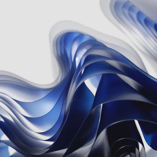

PANTONE 19-4150 | Princess Blue & PANTONE 13-4403 | Silver Birch
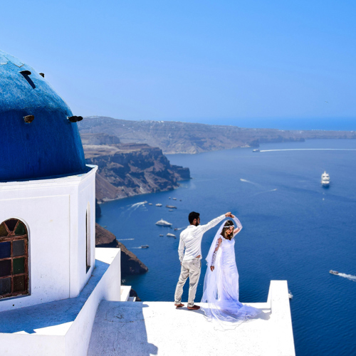
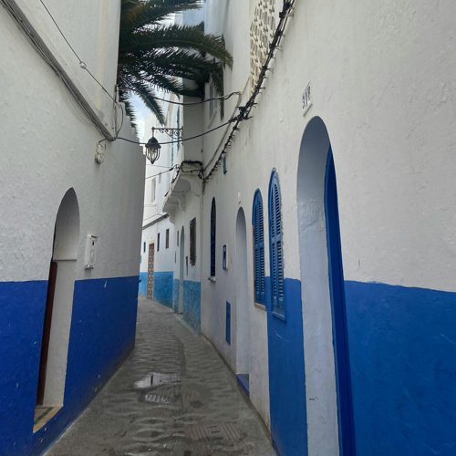
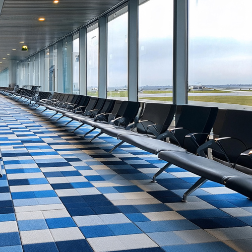
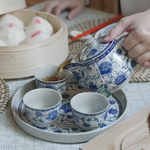
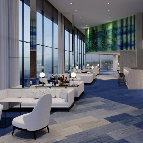
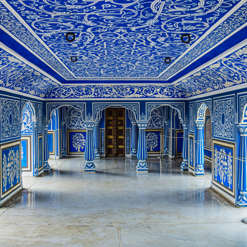
Pantone color Princess Blue conveys trust, stability, and calm—qualities essential in travel environments where passengers often experience stress. Its depth anchors a space, offering reassurance and quiet confidence. It is a color that grounds architecture with presence and identity.
Pantone color Silver Birch, with its reflective and clean character, amplifies brightness and spatial clarity. It captures and distributes light, creating openness and enhancing the perception of space. Where Princess Blue provides depth, Silver Birch introduces air and movement.
Across architecture, airport waiting rooms, and hotel lobbies, these two tones create a visual dialogue between stability and light. One color grounds, the other elevates. Together, they establish a refined architectural language defined by clarity, elegance, and calm authority.
At B.I.G. Yarns, color is never just a surface choice—it is an architectural tool. A way to shape emotion, guide perception, and define atmosphere. When two shades meet in perfect harmony, the result is more than aesthetic—it becomes experiential.
The pairing of Princess Blue and Silver Birch is exactly that: a match made in heaven.

Published by B.I.G. Yarns' Color Development Team, March 2026
